Pappsen / The project
From launch materials to the first click.
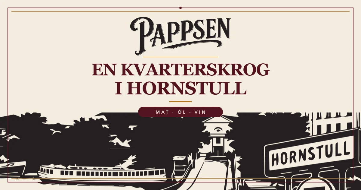
Pappsen’s logo anchors its identity. We extended it to window graphics and a flyer, and built a website that reflects the neighbourhood restaurant’s own character. Visitors can immediately see that Pappsen is a neighbourhood restaurant in Hornstull and easily get in touch.
Visit Pappsen’s website How we workedA distinctive logo, a place in Hornstull and the need for a first announcement.
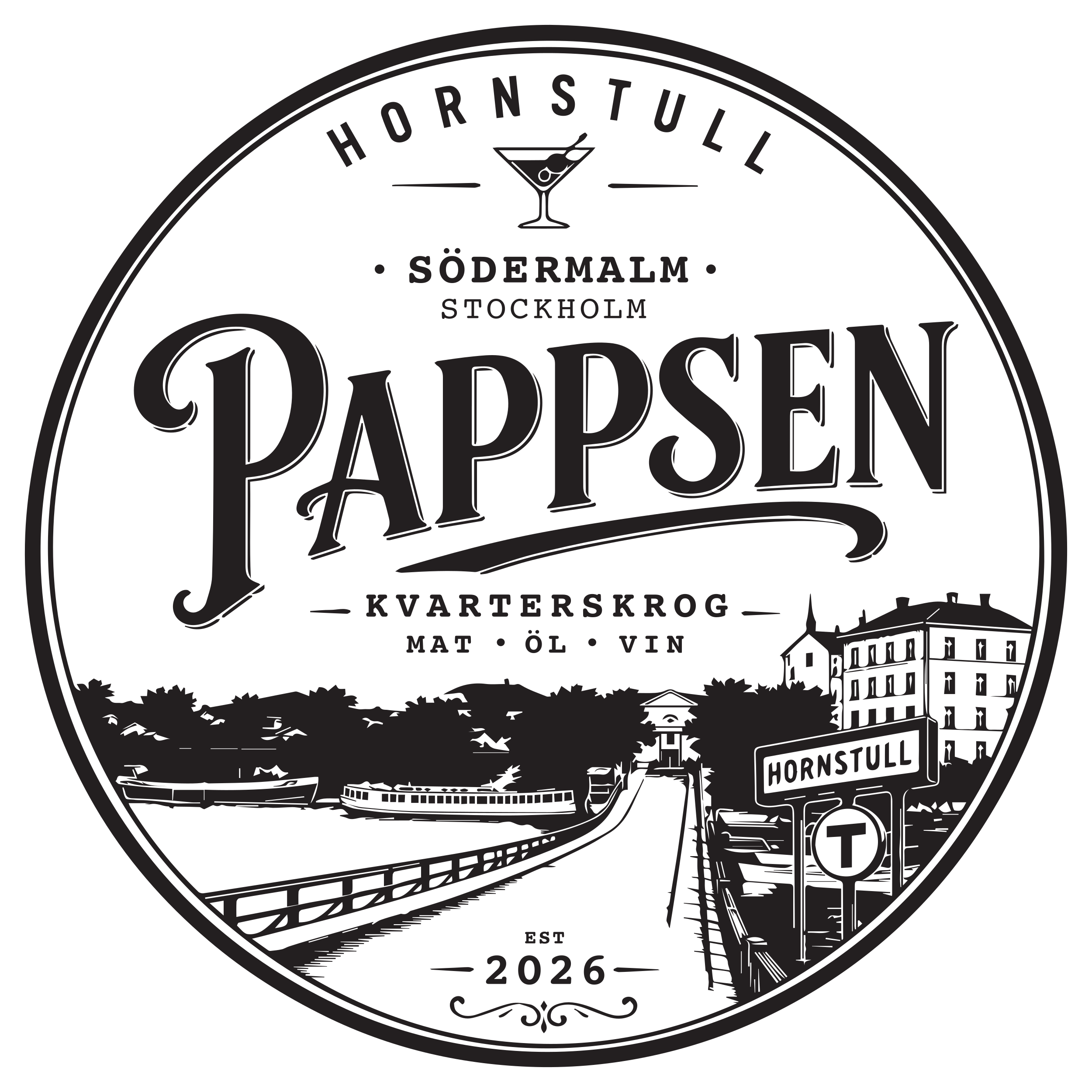
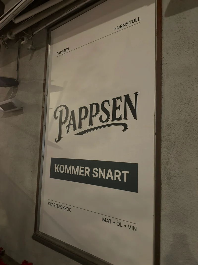
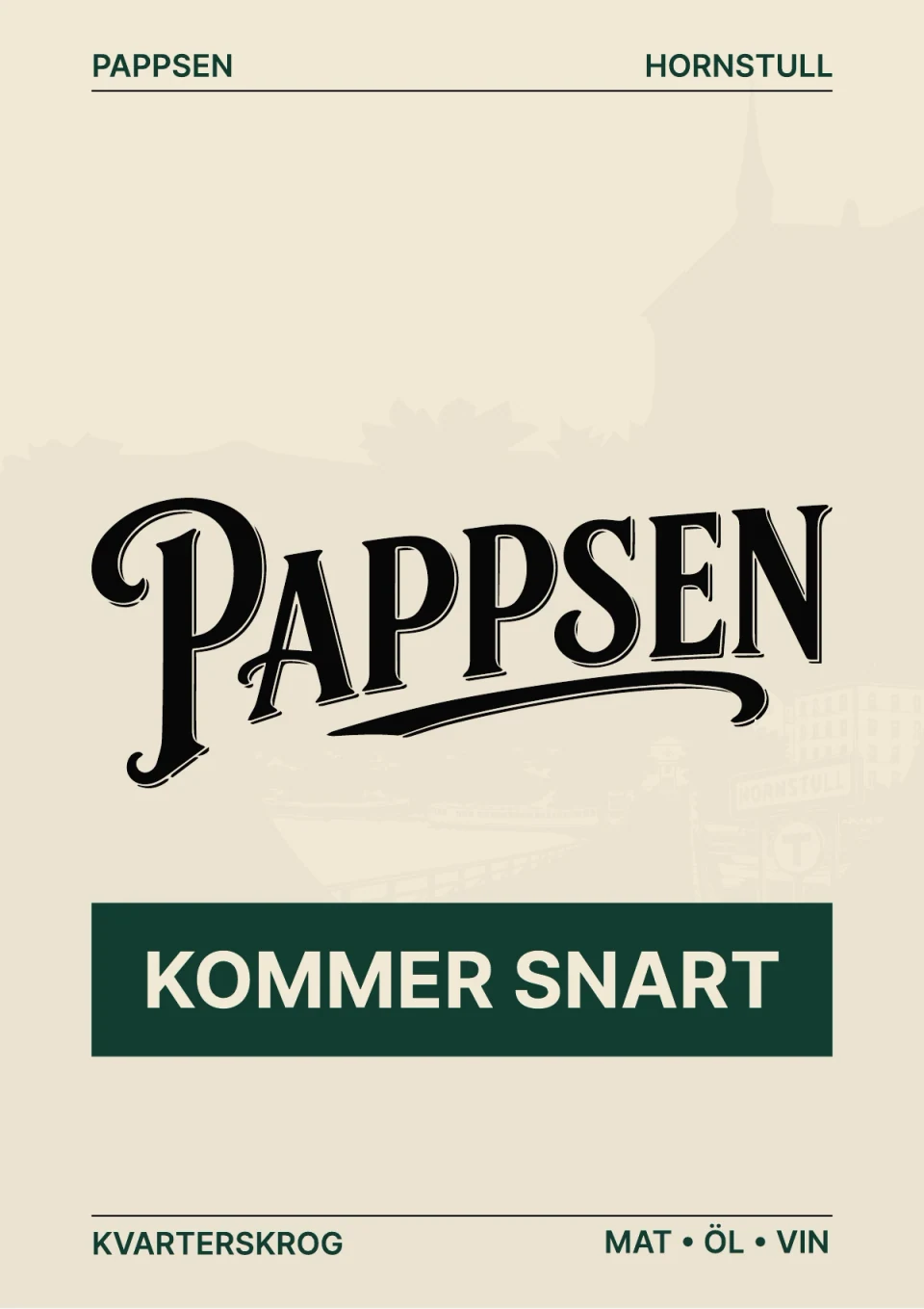
The logo and opening message were brought into a flyer and window materials.
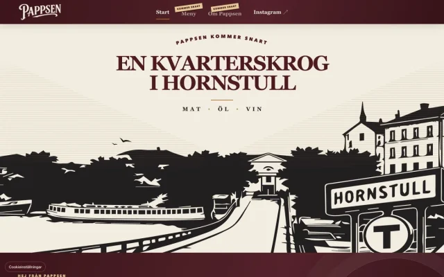
The updated website presents the neighbourhood restaurant, Hornstull and food · beer · wine in a new expression with clear email contact.
PAPPSEN / IDENTITY IN DETAIL
A whole neighbourhood.
In a single mark.
Letterforms, a glass, linework and Hornstull. Pappsen’s identity holds more than an opening announcement. Here, the craft takes centre stage.
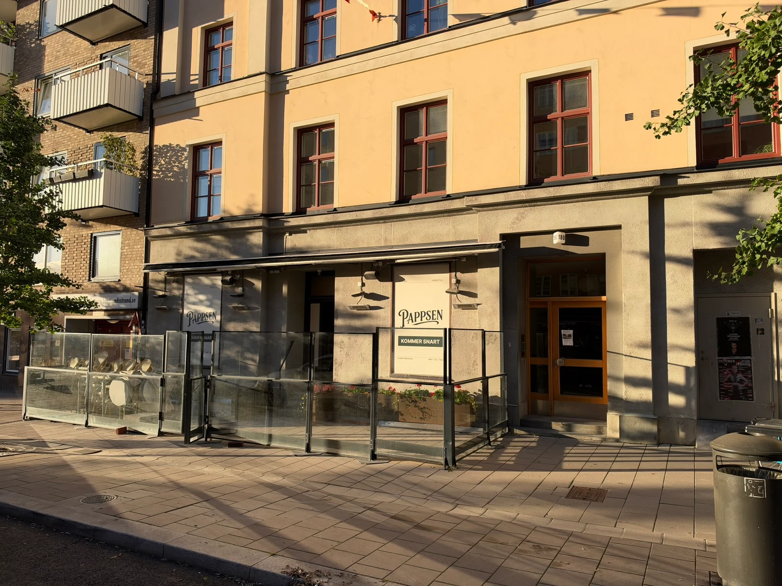
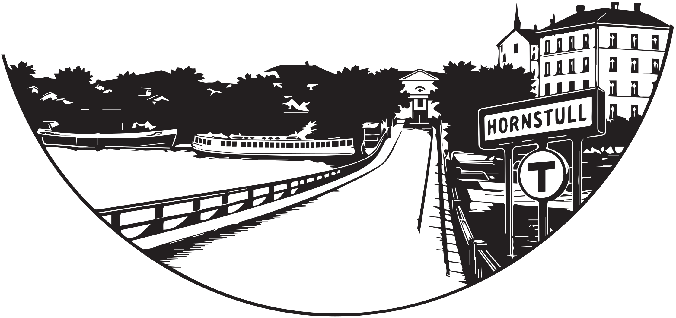
Hornstull.
Part of the drawing.
A first announcement on the street. A distinct identity on the web.
Explore the next stepThe same logo.
A new encounter on the web.
Pappsen’s logo ties the work together. The black linework, pale paper tone and illustrations of Hornstull give the neighbourhood restaurant its own character. The flyer’s green opening message and the website’s burgundy details each have their own setting.

A strong serif gives the neighbourhood restaurant presence; small labels and clear links make the page easy to read.
A light paper colour and black illustration hold the expression together. Green appears in the flyer and burgundy in the website’s details.
How we worked / Before everything was ready
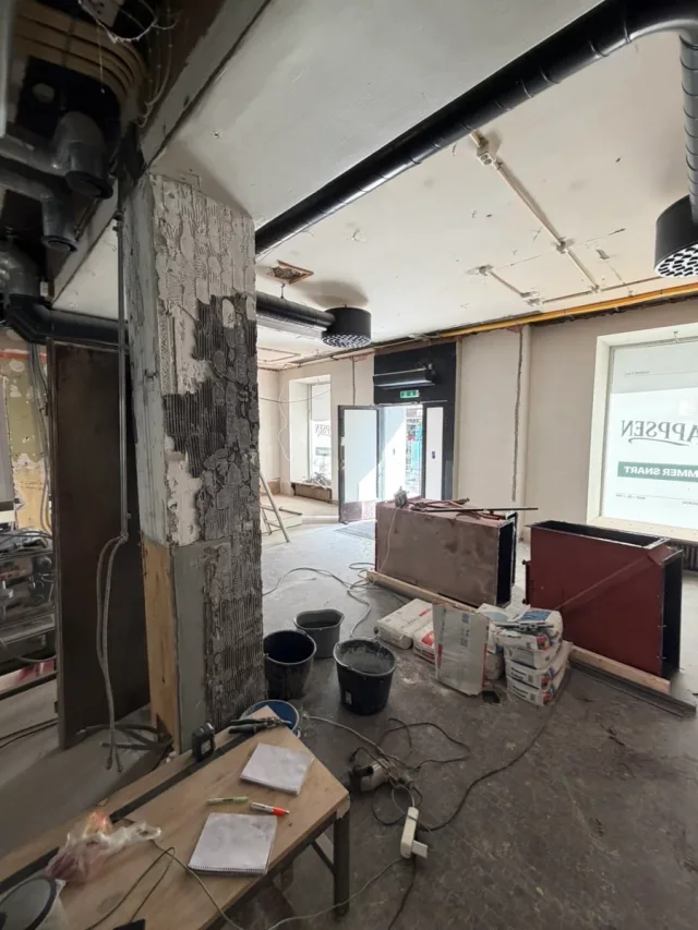
The premises were being renovated. The message could already be clear.
Pappsen needed to introduce itself while the neighbourhood restaurant was taking shape. We worked on an initial window announcement and a website that could be used straight away.
The logo existed. We carried it forward.
We started with Pappsen’s identity. We designed the opening material in Figma and let the name, Coming soon and Food · Beer · Wine carry the message. It needed to be understood without a long explanation.
The window and flyer needed different formats.
In the window, the name and opening message needed presence. The flyer received its own format, with a black logo, light background and a green Kommer snart message. The client’s photograph shows the materials in the street-facing windows during renovation.
Hornstull carried through to the website.
The burgundy and cream website uses an illustrated local scene and large, readable headings. On mobile, the illustration and text receive their own composition. The logo holds the identity together across the different versions.
The first website made the next step easy.
Visitors learn what Pappsen is, where the neighbourhood restaurant is and how to email directly. The menu and further information are marked as coming soon, making clear what is available to read now.
What needs to be ready for your first website?Start simply
What could we do for your business?
What should your website help customers understand or do? A short question and your email address are enough to start a conversation with us about your business.
Websites for restaurants, bars and cafés Need materials for an opening? Explore Nolera Social Talk to us about your website Would you like to start with a free homepage preview? We reply personally · no paid work starts without your go-ahead