 Hornsgatan 174 / Stockholm
The room, the music, the place. It all starts before the first visit.
TIME Bar / The project
An evening on Hornsgatan, on screen too.
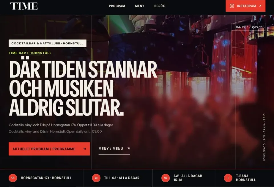
TIME already had its own logo and a setting with a strong character. Our job was to bring that feeling to a website that is also easy to use: what is happening, what is on the menu and how do you get there?
Visit TIME’s website How we workedFrom place to function
We drew on the music, lighting and TIME’s existing identity in imagery and typography.
The programme, menu and visitor information each received a clear route.
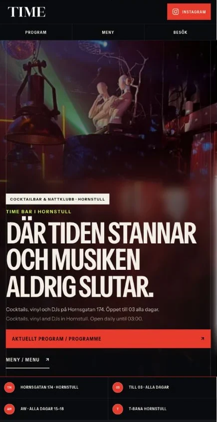
On mobile, visitors can quickly find their bearings and the address.
How we worked / From visit to website
The feeling of the room. The answers for your evening.
A visit to TIME was our starting point: how could the bar’s own world carry through to a website while helping someone who had never been there?
The setting shaped the first impression.
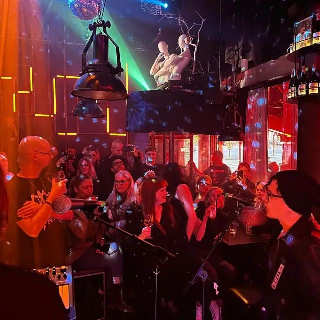
TIME already had music, coloured lighting, sculptures and its own logo. We used their materials and kept that recognisable identity. The live performance photo also appears on TIME’s website; it shows the place’s own energy.
The menu became content you could navigate.
Food, cocktails, beer, wine, spirits and alcohol-free drinks each received their own section. Guests can go straight to a category and open what they want to read. Regular and happy-hour prices are explained in the menu, while the PDF remains available to download.
Run a restaurant? Use our checklist for a readable mobile menu when planning your content.
Mobile received clear main choices.
Programme, Menu and Visit have their own row in the mobile navigation. We adapted the image crop and text placement to the screen, while keeping headings and links as readable web text.
The information had a clear owner.
The programme is compiled from organisers’ and TIME’s sources. The visitor page brings together the address, opening hours and map links. This content needs to stay current after the website itself is built.
TIME’s own world.
A website that feels like the place.
We let what already made TIME recognisable shape the design: the dark room, light logo and poster-like rhythm. We then gave the information quieter reading spaces, so character and usability work together.
A straightforward voice for information. League Gothic provides a more compact, poster-like expression.
A dark base, light text and a sharp red accent in TIME’s website.
Start simply
What could we do for your business?
What should your website help customers understand or do? A short question and your email address are enough to start a conversation with us about your business.
Websites for restaurants, bars and cafés Talk to us about your website Would you like to start with a free homepage preview? We reply personally · no paid work starts without your go-ahead